This article showcases how the brand color (primary) and secondary color can be customized in ISL Light Client and ISL Light.
Brand colour
The brand colour is utilized for the primary button, such as the "Join" button, as well as for the colour of online and connected computer icons.
In cases where the button background and text colour lack sufficient contrast, the text colour will be automatically inverted to white. This adjustment guarantees a satisfactory contrast ratio between the button background and text.
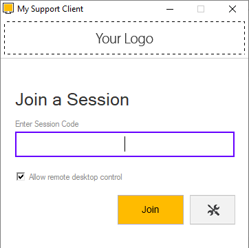
ISL Light Client > Join Button > Colour orange #ffbb00 (example)
ISL Light > Connect button > Colour orange #ffbb00 (example)
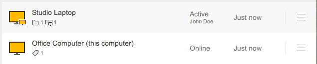
ISL Light > Computers > Online/Active icon > Colour orange #ffbb00 (example
Secondary colour
The secondary colour is applied to links, active input field borders, checkboxes, radio buttons, and similar elements. The default colour used by ISL Online is #0066cb.
We advise selecting a colour that is optimized for a white background. For instance, colours like yellow or light shades may have reduced visibility when contrasted with a white background.
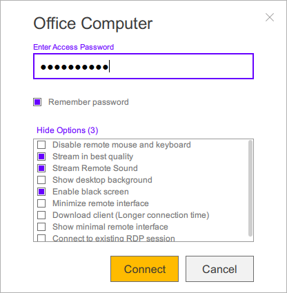
ISL Light > Secondary colour purple #6600ff (example)

ISL Light Client > Secondary colour purple #6600ff (purple example)
Once you have choosen colours, please refer to the "Request Customization" for further instructions.
Server licence users: the process for server license users is different than the process for hosted service users. Please refer to the Customization Manual.